In today’s digital landscape, where users access websites on a wide range of devices, ensuring a seamless user experience is paramount. Responsive web design has emerged as a game-changer, enabling designers and developers to create websites that adapt effortlessly to different screen sizes and resolutions. In this article, we will explore the significance of responsive web design and how it caters to users on various devices.
- Understanding Responsive Web Design
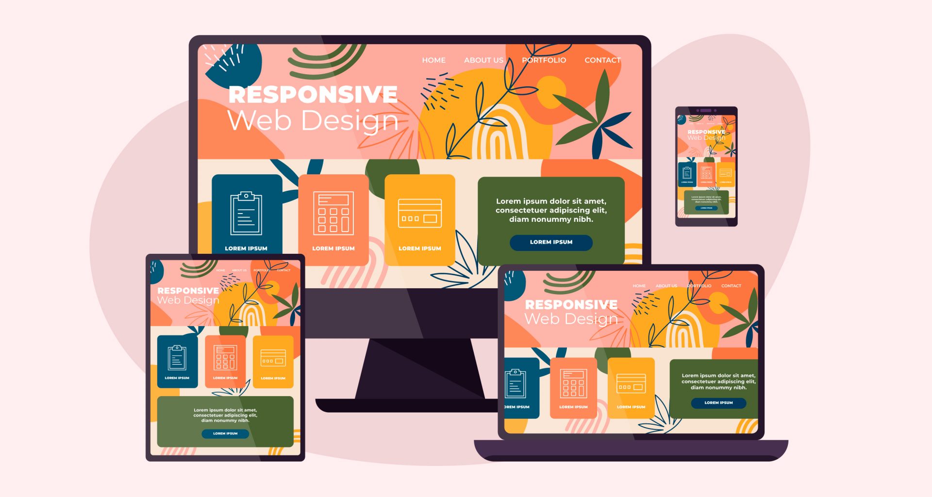
Responsive web design is an approach that allows a website to automatically adjust its layout and content based on the user’s device. Whether the user is accessing the site on a desktop computer, laptop, tablet, or smartphone, a responsive website will scale, rearrange, and resize elements to provide an optimal viewing experience. This design philosophy ensures that the website’s usability, readability, and accessibility remain consistent across all platforms.
- Importance of Responsive Web Design
2.1. Mobile-First Approach: As mobile usage continues to grow exponentially, it is essential to prioritize mobile devices during the web design process. A responsive, mobile-first approach ensures that the website delivers an exceptional user experience on smaller screens, setting the foundation for a seamless transition to larger devices.
2.2. Enhanced User Experience: Responsive design eliminates the need for users to zoom, pan, or scroll excessively, which often leads to frustration. By delivering a smooth and intuitive experience, responsive websites encourage higher engagement, longer visit durations, and increased conversion rates.
2.3. SEO Benefits: Search engines like Google prioritize mobile-friendly websites in their search results. A responsive web design not only improves search engine rankings but also avoids content duplication, leading to a better overall SEO strategy.
2.4. Cost-Efficiency: In the past, businesses often created separate websites for different devices, resulting in higher development and maintenance costs. Responsive web design streamlines this process, reducing expenses associated with managing multiple versions of a site.
- Key Principles of Responsive Web Design
3.1. Fluid Grids: Using relative units such as percentages instead of fixed pixels allows the website’s layout to adapt fluidly to different screen sizes. This ensures that the design maintains its proportion and spacing across various devices.
3.2. Flexible Images: Employing CSS techniques like max-width ensures that images can scale down proportionally to fit smaller screens without losing clarity or breaking the layout.
3.3. Media Queries: Media queries enable developers to apply different styles and layouts based on the device’s characteristics, such as screen width, resolution, or orientation.
3.4. Touchscreen Optimization: For mobile devices, optimizing elements for touch interaction is crucial. Buttons and links should be adequately sized, and touch gestures should be implemented where appropriate.
- Testing and Optimization
To ensure a flawless user experience across all devices, thorough testing is essential. Web developers should utilize various testing tools and emulators to verify the website’s responsiveness on different devices and screen sizes. Regular updates and optimization based on user feedback will further enhance the website’s performance and user satisfaction.
Conclusion
In today’s multi-device world, responsive web design has become a fundamental aspect of successful web development. By embracing this approach, businesses can deliver an inclusive and user-centric experience that caters to all devices and screens. Creating websites that are accessible, engaging, and easy to navigate will undoubtedly result in higher user satisfaction and improved business outcomes. Embrace responsive web design to unlock the full potential of your online presence and stay ahead in the competitive digital landscape.